Case study · 10 Min Read


Role
Product design
Timeline
Dec '22 - Feb '23
TEAM
Milan · Graphics, Motion
Smriti · Product Manager
Arman · Front-End Developer
Naman · Back-End Developer
Overview
OpeninApp is a link shortener helping content creators to distribute their content. This project is solving the issue of links opening in the wrong place.
My primary focus was to address creator's frustrations while using links and find a solution that aligns with the business objectives.
THE Problem

WhAT IS IN-APP Browser?
If you click a link in Instagram you may see that instead of redirecting to the respective app or destination, the link opens in a browser within Instagram itself.
Why IN-APP Browser?
In-app browsers helps social media platforms to reduce drop-offs and increase engagement time by opening the links inside the platform.

In-App browsers
THE Problem Statement
My Brain
Hm, This might be fun…
Objective & goals
My Design APproach
Research → Ideate → Design → Prototype → Test → Launch
Research & Insights
wHAT IS DEEP LINKING? AND why?
Deep links are a type of link that send users directly to an app. Deep links produce a seamless user journey that reduces friction and churn.
Most of the creators used link shortener tools to shorten their existing. These link shorteners are primarily focused on marketer than creators. They had desktop first designs made it very difficult to use in mobile which 95% of creators are using.
How we did this?
We conducted more than 10 user interviews with creators as well as audience. We did competitor analysis to find market opportunity.
Interesting Insight
The idea to focus on mobile-first design came directly from creators who work primarily on their phones.

SWOT competitor analysis
IDEATION & CONCEPTS
My Brain
Wow, this can work because creators are using short links a lot and Deep links can open apps directly.
What's Next?
We need to understand user better, lets create a user persona and identify their pain points.
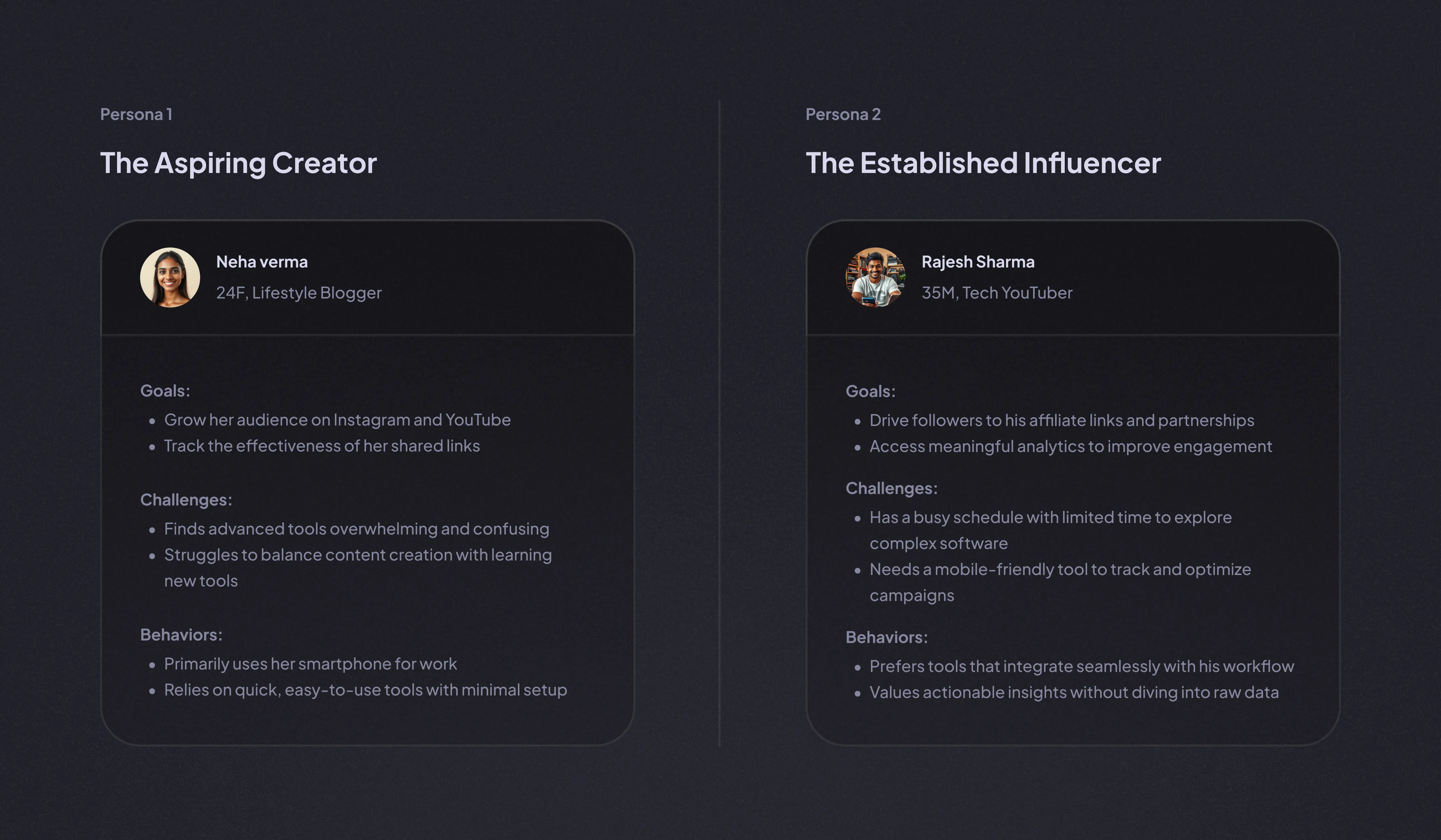
User Personas
What's Next?
Lets make user flows, wireframes and some sketches.
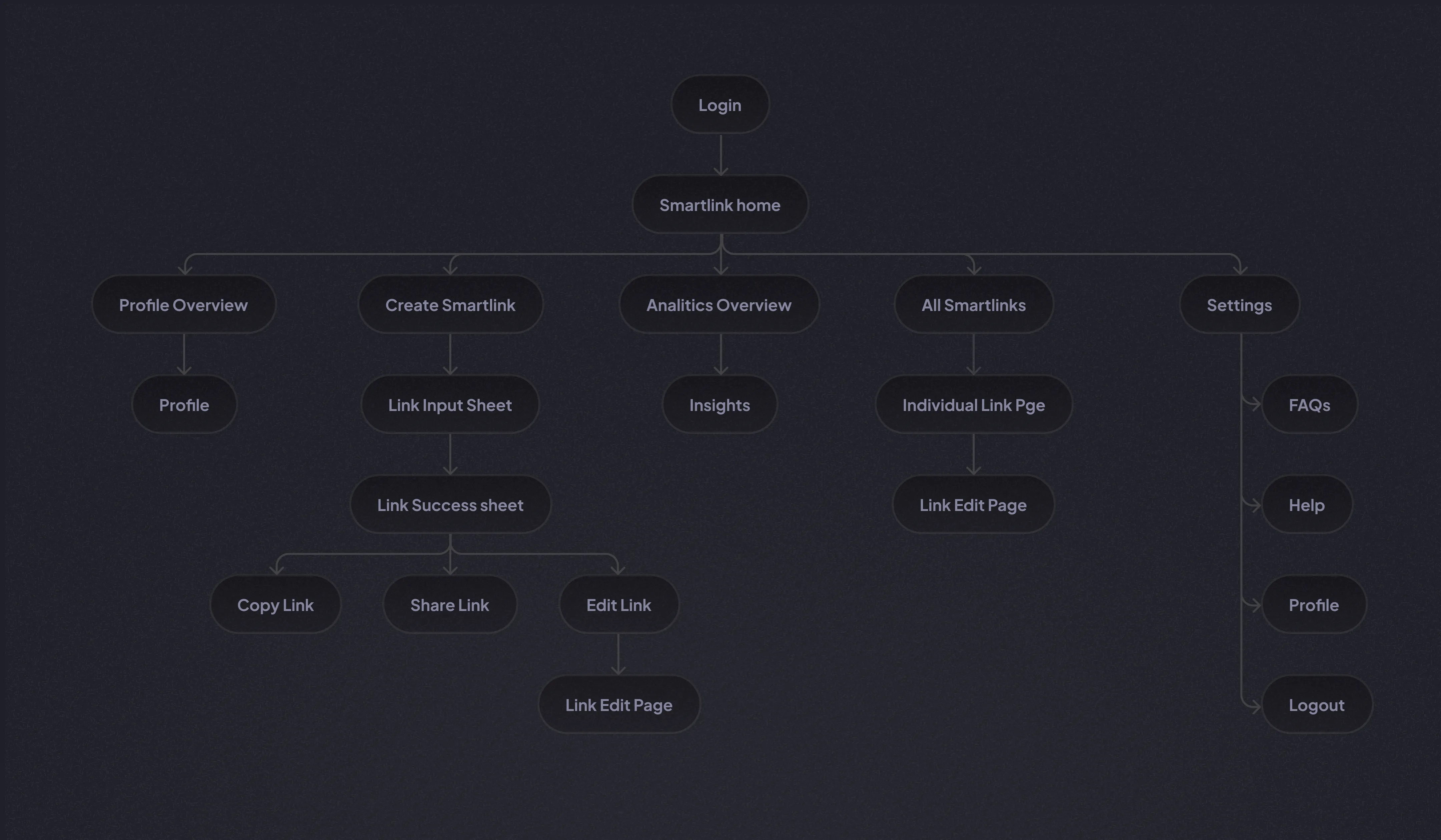
User flow
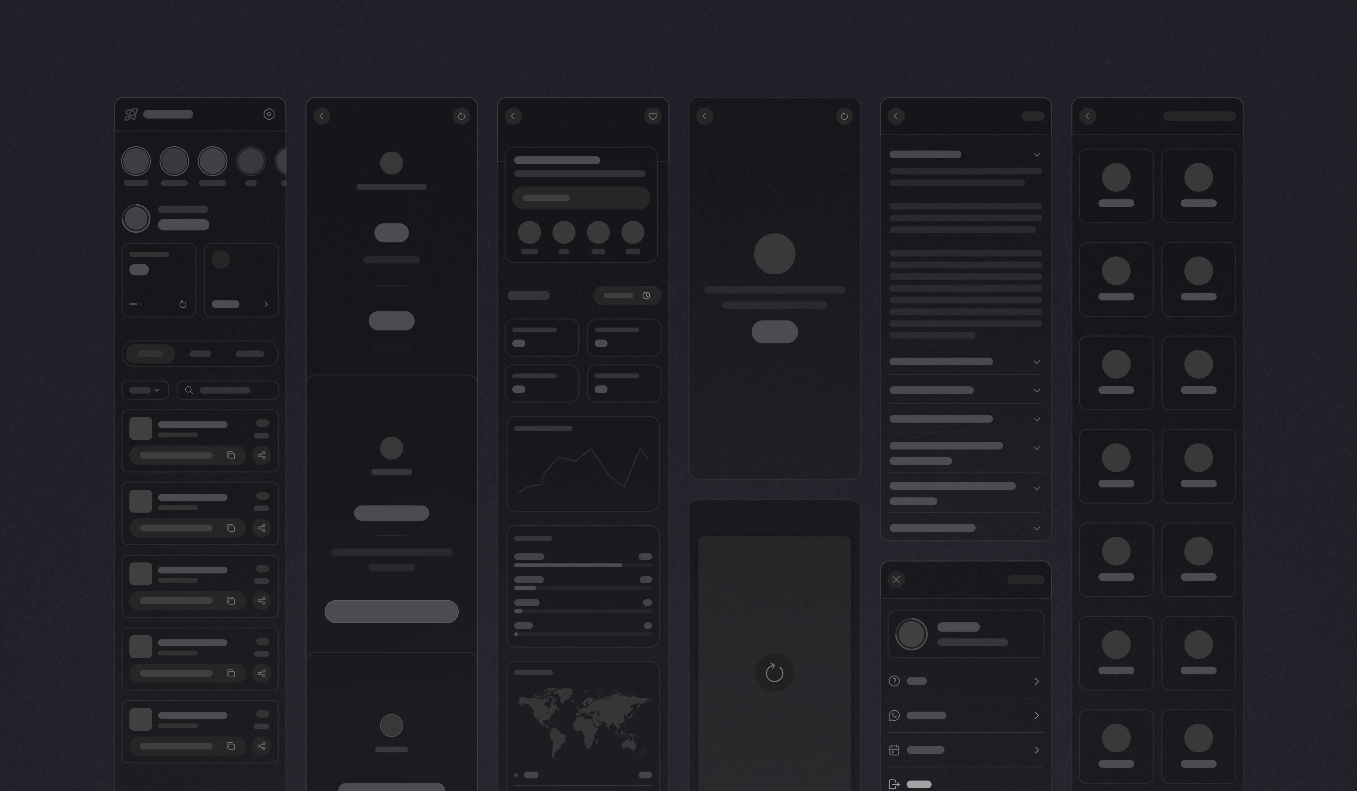
Wireframe System
MY BRAIN
Before starting the design, we need to validate the flow with user and stakeholders.
The solution
Smartlinks ensured all social media links to open in the respective apps rather than opening in in-app browsers. This simple solution can amplify distribution and maximize monetization for creators. It also enhances the user experience for their audience.

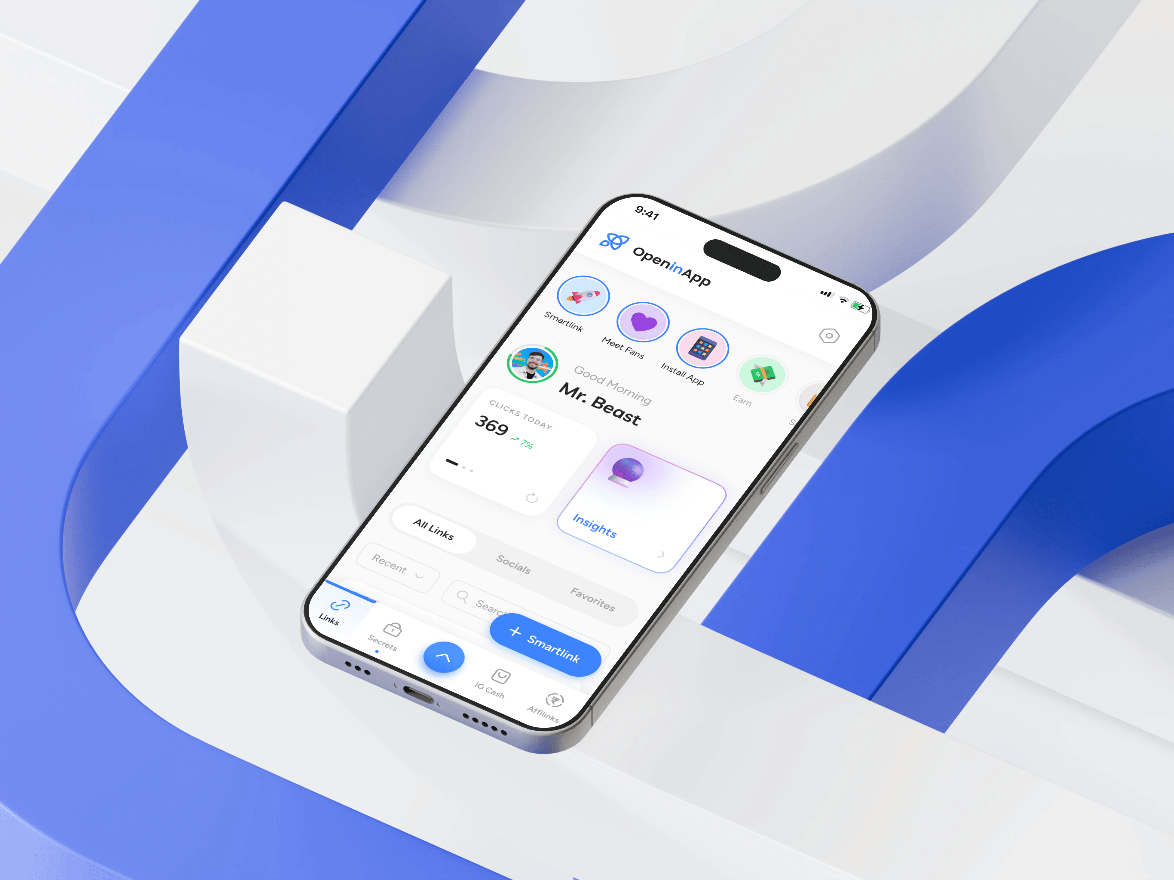
Smartlink Dashbaord
Smartlink Dashboard interactions
Interesting Fact
We took continues feedbacks and did a lot of iterations to come with final designs.
To ensure joy and blissfull experience, we created a design system that evokes these emotions with bright and playful style of design. It was my responsibility to make sure that the designs are yummy.
Candy Design System Sneak peek

Smartlink Dashboard desktop

Candy Design System Sneak peek
Super fast link creation
We designed intuitive and superfast smartlink creation flow by reducing the number of choices and prioritizing desired action for the user.

Smartlink Dashboard and Creation Screens
Creating a new Smartlink
Interesting decision
We swapped the share and edit options position each other for users who never tried the link editing feature. This increases the feature discoverability and increased click through rate by 30%.
Added a paste function in the destination link input to rapid creation, which reduced the link creation time by half. Hiding non essential things for reducing the cognitive load without losing the context.

Smartlink creation bottomsheet
We figured points where users can get confused or stuck and Integrated seamless video tutorials experience to avoid this. We added stories to the product to make awareness in user and feature discoverability

Entry points for video tutorials
Tutorial video playing interaction
Interesting decision
Since content creators spend more time in social media than anywhere, we tried to communicate through videos more over texts. For this we completely removed subtexts from the app and placed video cues where its needed
For creators showing graphs and numbers are just vague information. Not only that, from business perspective saving 15 rows of data for each redirection is a ton of data since we are driving millions of redirections daily.
To solve this, we created insights from analytics. We broke down analytics and applied algorithms to show insights on what creator want.

Insights screens

Insights screen analysis
Insights Interaction
Interesting decision
This was a trade off to reduce the server cost while maintaining the experience. Which in turns increased the insight feature discoverability by 50% and reduced server cost by 85%. But some powers users where disappointed and we are bringing analytics back as a paid feature in coming updates.
We put a lot of thought in making edit links very usable. We broke down the link structure and color coded them to make it intuitive. We matched the link appearance screen to real life link sharing experience.

Smartlink Editing screens
Interesting decision
In editing link appearance, we made the UI like a mock chat screen inspired from WhatsApp & Telegram where the shared link appeared similarly to connect the user how it looks when shared.
Designed for Creators
We designed the whole platform for simplicity, understandability and accessibility for content creators.

Other Screens
Onboarding Screen
IMPACT & OUTCOMES
My Brain
Hm… all those sleepless nights were shown in numbers.
Top creators in the world like Logan Paul, Neha Kakkar, Sidemen, Bhuvan Bam, Rishab Pant, KL Rahul and millions became loyal users of smartlinks. Even Prime minister of Italy, Georgia Meloni using usfor her PR works.

Top Creators link-bio screenshot
Learnings and Reflections
NEXT WORK


Yay! for youuu
